Three things to improve on The Frog Pond
My fellow Comic Fencer, Delos Woodruff, asked me if I could take a look at his comic and point out three things to improve upon. I was happy to oblige. Delos is very open to criticism; his blog at artpatient.com is dedicated to learning new techniques by reading other webcomics.
However, I’m not sure how much of my input will be useful to him. I review things from the perspective of a reader, some regular Joe surfing the web and reading webcomics to get his jollies. As an artist, I am average at best. So, if Delos is willing, I’m going to post my recommendations right here on my blog. You more professional types can go ahead and pick them apart of you reckon they reek too much of hooey or shenanigans or malarkey.
Delos’ comic is called The Frog Pond. It’s a tale of three boys as they go on fantastic journeys while voyaging the backwoods. I assume that their escapades are all products of an overactive imagination, not unlike the ones experienced by a urinary challenged boy in Calvin & Hobbes (which is referenced in one of the strips).
Be aware ahead of time that this post is going to sound rather nitpicky, so I ask for elegant forgiveness ahead of time.
Ready? Here we go!
MOST IMPORTANT/TOP THREE THINGS THAT NEEDED TO BE FIXICATED
Item #1.) The characters are too similar to each other.
Spike, Newt, and Gus have the same gumdrop-shaped head and same rail thin body style. The only distinguishing feature is the hair … and even that gets confusing when the comic isn’t rendered in color. Even their height looks about the same: they’re different heights in the picture above, but it’s not quite so apparent in other strips.
On a similar note, despite some attempts at trying to the three boys also aren’t very distinguishable personality-wise, either. For example, when Gus bullies around the aliens in one of your first story arcs, its felt forced and unnatural. I wondered to myself why this was so.
I played around with a whole list of suggestions: drastically redesigning the characters, giving them an actual wardrobe to accentuate their personalities, varying their body styles (like giving one kid broader shoulders), etc.
But then I thought that you might have your reasons for choosing the look that you did, and I decided that if you have good reason (such as maybe the characters are based on your real life boys or something), then you shouldn’t mess with that. (HOWEVER, if you’re going with the same style just because that’s how you started and you feel that you have to proceed in the same vein for the sake of continuity, then I say by all means take my above suggestions to heart. I point you to Scott DeWitt’s Fanboys, which started out with a style similar to yours but evolved to characters that were more expressive and distinct.)
So, I’m just going to leave you with four words: body language. Facial expressions.
Newt is the innocent, naive, and sweet one? How about sticking a more or less permanent goofy smile on his blank face? (If you’re already trying to do this, I suggest ramping up your efforts. Don’t be afraid to exaggerate!) One of the comics that does this rather well is Sluggy Freelance. Despite the comic’s simple style, you know that Torg is goofy and sorta brainless just by looking at his face. In Frog Pond, if you take away the hair and the freckles, Gus (the tough one) and Newt are nearly indistinguishable.
(While out at lunch, I started to think how the characters from Charles Shultz’s Peanuts are very similar in appearance. However, I claim that they are easily distinguishable from their expressions alone: a flustered, bewildered look almost always means Charlie Brown, while a crabby, angry look almost always means Lucy.)
Item #2.) Strive for a cleaner style. Ditch the cross-hatching.
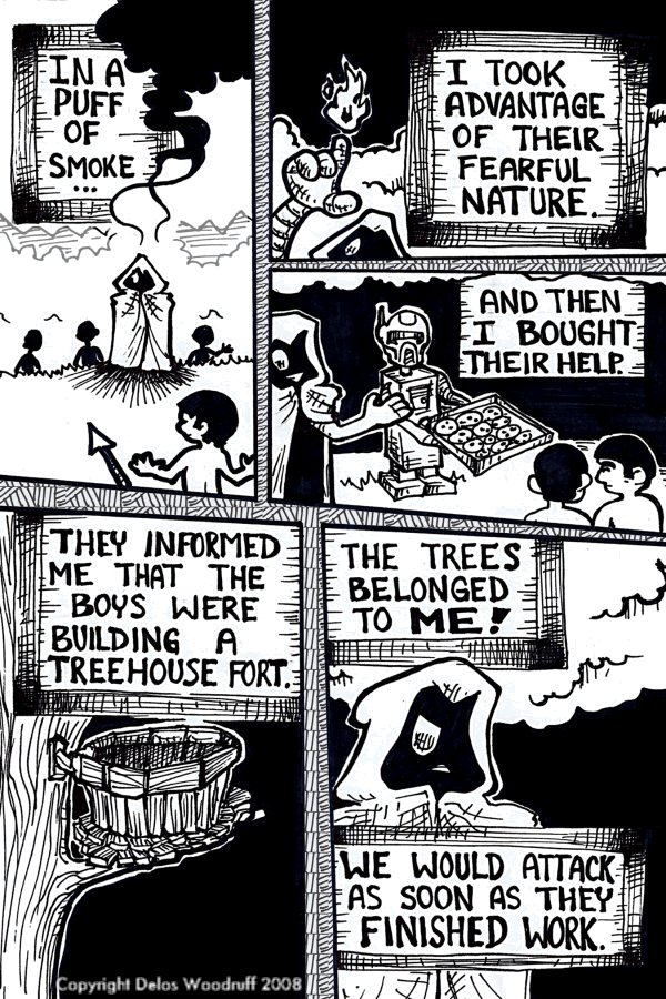
This one strikes close to home, since I typically use cross-hatching in a lot of the things I do. I mean, take a look at some of the original artwork on this site. Cross-hatching galore! I picked it up from a fellow artist in high school who liked to draw in a mixture of old woodcuts and psychadelic art. I notice a lot younger folk in their teens and early 20’s are putting out webcomics that still go for this look. However, I personally have been trying to wean myself away from this style. I think you should, too.
When I see something rendered in heavy inks and detailed with cross-hatching (like The Frog Pond‘s style), I tend to get the impression that the comic is of the bleak, alternative kind aimed squarely at disaffected kids in college. I blame Robert Crumb and the 1960’s counter-culture that spawned the San Francisco-area underground comix. But the fact is that, with some exceptions*, cross-hatching usually indicates something dour and sad.
Now, correct me if I’m wrong, but I think The Frog Pond is aimed primarily at children. You probably want to go with a look that’s cleaner. Two of the best drawn kid-friendly comics I’ve encountered on the ‘net are Dean Trippe’s Butterfly and Ryan Estrada’s Aki Alliance. While their respective artwork can work in a high amount of detail (Trippe especially), their comics gravitate towards a style that’s clean, rounded, and crisp.
So ditch the cross-hatching (and chicken-scratching). This applies to the shading, the text boxes, and spaces in between the borders.
Item #3.) Use photographs to help guide your drawings.
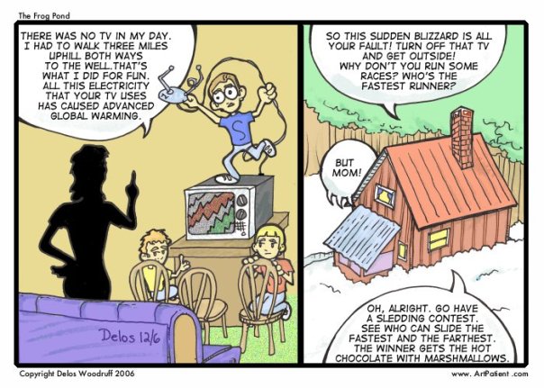
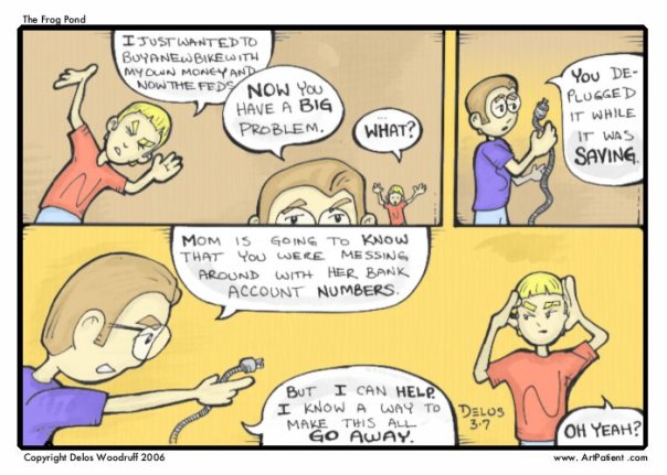
Now here’s where I get nitpicky. Stop me if I start sounding like a nagging old aunt. Several of the pictures bothered me. Here’s a sample:
The chimney in the final panel would not look like that relative to the rest of the house.
Ropes are typically coiled. The weave pattern makes the cord look kinda flat.
The hand gesture in the last panel looks awkward. I think he’s supposed to be rubbing his temples, but I’m not too sure.
So, back in the day when I took a cartooning class, the teacher told us to keep a folder full of magazine cutouts hands. So I got home, cut stuff out of the Sears circular, the auto classifieds, and the free magazine that came with the newspapers. And then … I never used them. I mean, how many times was I going to use a picture of a cardigan sweater? Now, that cartooning teacher was right on a lot of things, but he was totally wrong here.
Fortunately, we live in a world where google allows you to find pictures of any image on the internet. An even better option? DeviantArt. It’s not just for wannabe manga artists anymore. Type in any keyword (like, say, “cabin” for the first example) and you’re treated to some very professional looking photographs of cabins in a variety of settings. And if you don’t have the picture you’re looking for, do what the artists of The Zombie Hunters and Paradigm Shift do: go out on the town and snap pictures of the thing in question yourself.
If you don’t have a digital camera, don’t worry. There are other workarounds, like the newspaper clipping method I mentioned above.
What would I do with regards to the last strip? Well, the tried and true technique is to have a mirror in front of you while drawing. Look at your own face while you’re rubbing your temples. And then commit the drawing on paper (while conforming to the comic’s aesthetic, of course).
But, between you and me, I never liked the mirror thing. You have to keep looking up, and your position shifts ever so subtly … just enough to screw you up. That’s why I like the digital camera. Set the timer if you’re alone, snap a picture of yourself in the pose, post it on your computer screen, sketch a stick figure of your pose, and then flesh it out with your style.
Afterword
Originally, I was going to comment on something about the pacing. The story where the kids get launched into space on a snowball was a little confusing. The feeling of spectacle was lost on me. I was going to suggest that you spread your scenes out. However, in your latest story where the boys defend The Frog Pond against a cyborg kid and his clones, didn’t suffer form the same issues. So my guess is that you were already aware of the problem and it’s one of those things you were working on.
Also, if you decided to go back into color strips, I’ve be careful about using that paint fill function. The gradient tool is so ubiquitous nowadays that I can’t help but notice everywhere it’s being used. That’s the problem when a function comes standard with MS Office. I tend to do black and white myself, since I have no idea how to do color effectively. I have to say, some of your later effort was pretty decent…. only some anti-aliasing issues near the black-and-white lines and the paint fill to remedy.
However, I’m definitely not the one to talk to about that. About three years ago, I designed a logo (a coat-of-arms) for a small school. They use it rather prominently in their literature. One of my greatest pains is that they’ve printed my coat-of-arms on a large banner. The circular gradient I used for one of the design elements is displayed in all its glory. It haunts me every time I look at it.
* – Now, cross-hatching can work in other genres: Image Comics and it’s West Coast style used it to signify complex surface contours and lighting to mesh with the action-packed world of superheroes. However, those guys used very fine inks and lines of varying weights. I still wouldn’t use that in your comic, unless you were doing a Calvin & Hobbes type segue into a superhero fantasy. I remember seeing a comic in the papers using this style (the name escapes me at the moment), and it didn’t work for me at all.
Interestingly, of the artists practitioning the style, Mark Texiera usually had the heaviest inks. And his works were usually more low key and bleak than his counterparts.
Posted on September 3, 2008, in The Webcomic Overlook, webcomics. Bookmark the permalink. 7 Comments.


























































i can’t agree on the cross-hatching thing.
Which I guess isn’t that surprising, since I’m working on a kid friendly comic that uses a hatchy style.
I’m very much at odds with what’s fashionable in comics these days, but I really do prefer a rougher look then the sort of smooth animation looking stuff that seems popular today. I like scribbley stuff like Akiko, Sardine in Outer Space, or even Sock Monkey.
I know those all have very different art styles.
I guess my point is, I’m not convinced that hatching is the problem here, although I do agree that sometimes The Frog Pond looks like a comic for cranky 20-somethings. I believe the reason is two-fold:
1. Too many spot blacks. For a comic strip about whimsical adventures, the Frog Pond is absolutely drowning in darkness. I feel like this is a much bigger problem then the cross-hatching.
2. The character outlines seem a bit too thick and angular to me, especially in the latter comics. In the most recent ones they kind of bring to mind somebody angrily stabbing at the paper with a sharpie, which is not the most relaxing thought.
I’d say either make the outlines thinner, or, alternatively, just go nuts and curve the hell out of them, ie instead of giving characters an elbow, just make their arm one unbroken curve, like a piece of macaroni.
Anyway, that’s how I feel about it, but I’m probably even less of an artist then El Santo. But “clean” is overrated! Overrated, I say!
I agree about the cross-hatching thing. It looks archaic, not dark or sad. I haven’t read the comic, but there’s nothing un-child-friendly about the example you used. That’s actually a very nice page up there. Christopher is correct: It is the black fills that create the ominous feeling. But it also looks like it was meant to be a somewhat ominous page.
Cleaner is not better. Clean art reflects the computer age and has a tendency to lose soul, if that makes any sense. I’d actually suggest going for grainier grays, if you’re going to use fills. Or washes. Washes would work.
I suppose I concede the point, Christopher and Sly.
I don’t know if a clean look is necessarily a product of the computer age. Peanuts, Popeye, Uncle Scrooge, and Bone are all relatively clean, with little of the cross-hatching that I mentioned. I mean, they were incredibly detailed drawings, but they didn’t overshade their characters unless they were running around in a bayou or a crypt or something.
However, now that I think of it, Maurice Sendak in his children’s books tended to use a lot of crosshatching. He also used a thinner lines, though, which kinda goes hand in hand with what Christopher is saying.
I stand fast by my point that the comic looks kinda like an alternative weekly, though. 😐
Wow. What an interesting analysis.
I like the Frog Pond, and I like material about teenagers. I don’t think material about teens must be just for teens. I did a whole book for teens and most of the readers were adults.
The Frog Pond has elements that remind me of my own teens, growing up in rural NY. That’s a big appeal.
On my comics, I do the writing and storyboarding, and my wife does the finished art. Consequently I am a huge advocate of storyboarding. It gives you a chance to take a proposed scene and review it for content and positioning, which we do together in pencil before it goes to final production. These additional editing opportunities improve the strip a lot.
Making the characters more distinguished from one another sounds good to me. As someone who has read the strip, I think it would help. There are a zillions things you can stick on a character to distinguish them. Watch out for hats, though. They can create new problems.
I like some color comics that are bright, like Best Band in the Universe, but I prefer washed out colors (see what I mean: lilnyet.com and scratchinpostcomics.com ). If you study real life, intense colors are reserved for safety signals, billboards and ski apparel. If you do color, take advantage of the Photoshop pallet to name and save your colors. We have colors saved down to the detail of how someone’s eyeglasses lens looks if you are looking through it at them, or it you are looking through it past them.
I think The Frog Pond has a lot of potential, and if Delos is willing to put his work out for scrutiny if says a lot about him as an artist. I have only done that once myself, and it helped a lot, thought I didn’t follow every suggestion.
Pingback: I want to do this well. | the Frog Pond Comic
Pingback: Strip News | ArtPatient.com
Pingback: The Gigcast - Your Webcomics Podcast » Blog Archive » Webcomic Wire - 9/5/08